It's been a while since I updated this blog since I've been so focused on
Chronicles of a Daytrader, but here's a useful little tidbit that explains why I think candlestick charting is so valuable to understand. Before we get into that though, you should understand what I mean when I say candlestick charting.
When you look at the chart of a stock's price, there are a number of ways that it can be displayed. It can be a line chart, a bar chart, an OHLC (open, high, low, close) chart or a candlestick chart. There are other, less popular variations like the Chinese candlestick chart and the point and figure chart, but for this post we'll stick to the most popular ones. By far the two most popular charts are OHLC charts and candlestick charts, with, for technical traders, candlestick charts being the most popular. This is a candlestick chart:
 |
| click to enlarge |
This might look confusing at first but it's really quite simple if you understand some basic conventions. Of course there are hundreds of ways to customize your charts, but the basic and most popular configurations always include something like the following conditions:
- Each of the bars in the "price history" (top) part of the chart is called a "candle" or a "candlestick." Each candle represents a specific period of time. In the case of the chart above each bar represents one day of price movement (a "daily" chart). If you were looking at a 30 minute chart, each bar would represent 30 minutes, and on a five minute chart each bar would represent five minutes.
- Green bars represent an increase in price.
- Red bars represent a decrease in price.
- Bars can either be filled or unfilled. This is completely up to personal preference. I fill red bars because I think it makes the chart more visually appealing. You can also change the colors all you want.
- The green and red bars at the bottom represent volume. This is not included by default but I don't know a single technical trader who doesn't use it. Volume simply represents the number of shares of the stock that changed hands.
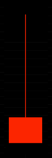
Now that you know the basic design of a candlestick chart, let's dissect an individual candle and see why these little bars are so powerful. Here is the candle for 8/21/12:
 |
| click to enlarge |
If we look at this candle we can immediately assume one thing: we know that price went down because the candle is red. But how do we know where the price actually opened, and where it closed? What was the high of the day and low of the day? That's where candlesticks shine:
 |
| click to enlarge |
The "boxy" part of the candle is called the body and shows you the relationship between the open and the close. The "wicks" or "tails" represent the high and low of the day. Everything in between is what the price did during the day. Since this candle is red, and we know red bars mean the price went down, we know that the top left corner of the box must be the open, and the bottom right must be the close (since the close was lower than the open). If this candle were green, we would still read from left to right, except since the close would be above the open, the bottom left corner of the candle would be the open, and the top right the close. Also, the whole candle would be green. If you want to know the exact prices of the open, high, low and close, most charting programs will simply pop up a box telling you what they are when you click on the candle.
When you look at this candle you can see why it is so powerful. It gives you four pieces of valuable information in a very small amount of space. For me, it helps to visualize the candle as a fluid representation of price (as strange as that sounds). Let me show you what I mean. Did the price do this?
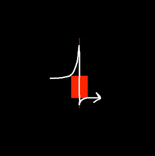 |
| click to emlarge |
Or maybe this?
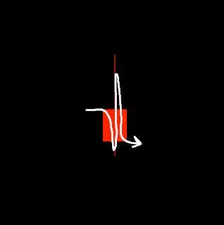 |
| click to enlarge |
The only way you can really tell is to go to a smaller timeframe...like a 30 minute or a five minute chart. If you look at a five minute chart of this day (8/21/12) you will see exactly what this candle represents:
 |
| click to enlarge |
From the five minute chart we can gather that price went up in the morning, then slowly ticked down all day, and rose slightly at the end of the day. Most of this information, however, can be quickly attained just by looking at that one candle on 8/21/12 on the daily chart! You can easily see that the price closed in the red. You can see that the price rose significantly above its opening price at some point, and that it closed above the low of the day. Candles make it extremely easy to quickly gather data about what market participants were feeling that day (or 30 minutes, or 5 minutes, or even 1 minute). For example, did the stock open at a certain price, never dip below that price, and then close at the high of the day, as in this candle?
 |
| click to enlarge |
What does this tell us? Since the open equals the low and the high equals the close, it tells us the people trading the stock drove the price up
hard right from the get-go and sellers were not even able to push the price down below the open. It also tells us that the buyers were able to keep the stock rising all the way until the end of the day. That could mean the price might continue to go up the next day!
Or maybe the stock opened at some price, dipped
way below that price, but then buyers came in to push it back up and it closed at the high of the day, above the open, like this:
 |
| click to enlarge |
This is called a "hammer," (since it looks like a hammer, obviously) and is one of the most promising candlesticks you can see if you want the price to go up. If you think about it logically you can see why. What it tells us is that the price opened at the bottom left corner of the body of the candle, was driven down hard by sellers, but by the end of the time period the price had been driven all the way back up, not only to the opening price, but to a high and a close
above the opening price! From a psychological standpoint this tells us that the stock has strong buying pressure (demand for it is strong) and that sellers were not able to drive the price down even though they tried. The reverse could also be true. If we see a candle that opens at some price, is driven way up during the day, and then there is a sell off into the close and the closing price is at the low of the day, below the open (an "inverted hammer" or "falling star,") it could mean that the price has hit a top where people simply are not willing to pay any more and that the price must come back down soon:
 |
| click to enlarge |
If you understand these basic principles about how candlesticks are used you will be able to quickly gather lots of information about the sentiment of market participants. Understanding sentiment is a huge step towards predicting future price action. There are hundreds of candlestick patterns that can represent all sorts of different things but the meat of your understanding should be here, in understanding what each part of an individual candle represents, and what the overall shape of the candle can tell us about the price action and thus the feelings of market participants during that time period. It doesn't matter whether it's a day, a week, five minutes, or one minute. The design of the candle is the same, and the feelings of the people buying and selling the stock are still represented by its shape.
Once you become good at reading candles and drawing conclusions about what they represent, you'll find yourself able to better predict what the price might do in the future based on the price action during the time period that the candle represents. As you do this more and more, you'll start to develop a sort of intuition for what might happen next. And if you can predict price action accurately, well then making consistent money trading stocks becomes as simple as buying before the price goes up and selling before the price goes down.


